Urban
Analog Studio
Prof. Mark Raymond
, Soumya Dasgupta
Apr, 2021
Analog Studio
Prof. Mark Raymond
, Soumya Dasgupta
Apr, 2021
As part of the Analog Studio series of work, students created a series of drawings to enhance our awareness of spatiality, architectural sensibility, and personal history. The six drawings included a one word title prompt, sequentially portrait, assembly, personal room, common room, urban, and landscape.
I grew up in two cities – Taipei and Toronto. Initially my first instinct was to gravitate toward depicting Toronto. This is partly because it is fresh in my mind, as I lived there the past 5 years, but it is also because I went through my undergraduate degree and gained spatial knowledge there, which made me much more spatially aware of the city when compared to my hometown. One of the most prominent impressions I have of Toronto is the streetcar system. While Toronto has a subway line, the city is too spread out for the subway system to effectively work, which makes the streetcar the most important public transit system in Toronto.
The streetcars have prominent existence on the urban soundscape, even when walking on the streets of Toronto. The sound of the streetcar wheels grinding against the rails, the dings to indicate stops, and the sparks sometimes caused by the cables are all familiar sounds in Toronto. The streetcars also establish themselves visually. Streetcars take up an entire lane on the streets, while the skyscape of Toronto is covered in interweaving streetcar cables. This aspect of streetcar cables distorting the sky is what I wanted to focus on. The denser the cable lines and the heavier the distortion, the busier the area is, as more streetcars pass by the area. This led to my decision in including an aspect of sewing into the drawing. Similar to how the streetcar cables physically draw connections in the city fabric, the drawing would sew invisible connections together.
With a depiction of Toronto developed, I went back to analyse why I had a harder time depicting my hometown, Taipei. I contribute that mainly to the fact that I started my architectural education in Toronto, and I was less aware of spatial qualities prior to that. My years in Taipei were heavily centered around education, where most of my days are spent commuting between school and back home. In this busy schedule, a small relief would be the time in between walking from school to home, where I pass by a few streets that can be categorised as night markets. I remember vividly the messiness and visual clutter of these streets: Commercial store signs trying to out-compete each other with vibrant colours, the crowdedness of people, and the compressed space of commercial verandas. As I looked back into memory, it became clear to me that visual vibrancy and clutter is my main impression of Taipei.
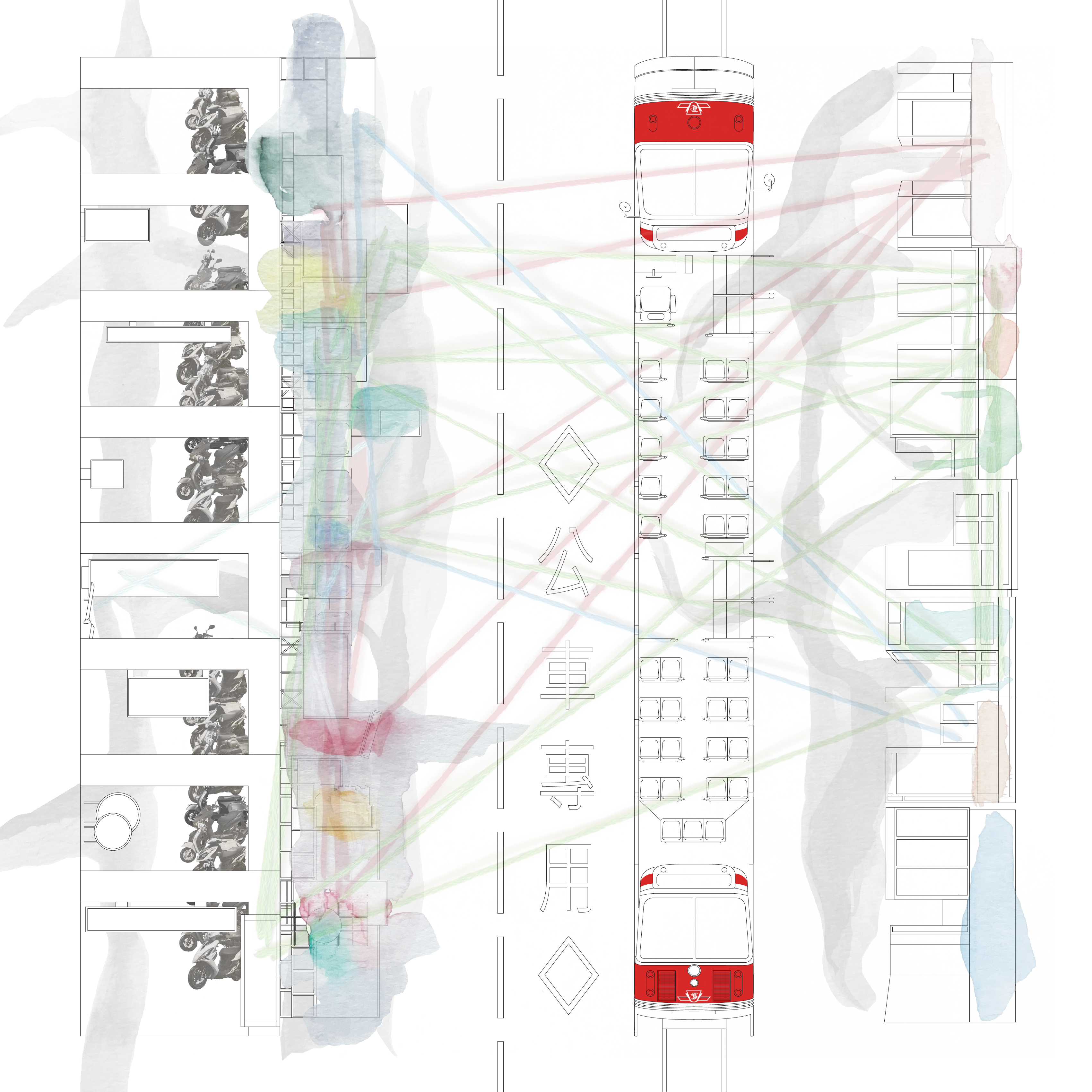
I then moved to depict Shida Street in Taipei, a street by National Taiwan Normal University and is vibrant in street vendors, eatery, and apparel during the night. To emphasise the verandas, a typical archetype in the Taipei streetscape to improve the pedestrian experience in the rainy climate of Taipei, I depicted the Taipei streetscape by stacking a street elevation view, creating a blend between a plan and elevation. Scooters, a common element among Taipei and marks the main experiential difference between Taipei and Toronto for me, are parked under the verandas, while the calligraphic brushstroke marks human movement, much like my previous works.
With discussion and feedback with Professor Raymond, I decided to move on by combining my two urban experiences together into one drawing instead of only choosing to depict one. This choice is to reflect an autobiographical experience, where both Taipei and Toronto have important influences on my growth. I decided to depict the streetscape created by storefronts for both cities, with varying projection angles, and to physically connect to the two cities together by sewing.
While the streetscape of Taipei is a blend between a street elevation and a plan to emphasise the repitition of veranda bays, Toronto’s streetscape (namely Queen Street) is shown as a typical elevational view of storefronts. This choice is to reflect the experience of the Toronto streetscape when one is on a streetcar, where architectural details become less noticeable and the only remaining visual element is signage. As commercial signage is a common element for the two cities, they are highlighted with watercolours lightly, where it becomes apparent that the density of stores on a street in Toronto is much sparser than that of Taipei where the watercolour signages become murkier with an abundance of colours blending. Finally, the act of sewing starts to analyse the commercial activities of the two city streets: Red thread connecting points of eatery, green locations of apparel, dark blue as bookstores, pink as academic, and light blue as medical locations. This interweaving of threads starts to visually showcase experiential and commercial activity differences between the two cities, where stores are denser in Taipei and have a wider variety of store types, where Queen street in Toronto has more generous storefronts with an emphasis on apparel stores.
